The Problem
Yalla Oats was a growing overnight brand, however their packaging was holding them back from reaching their full potential. Their original brown paper cups had a myriad of issues that impacted consumer perception, product quality, and operational efficiency.
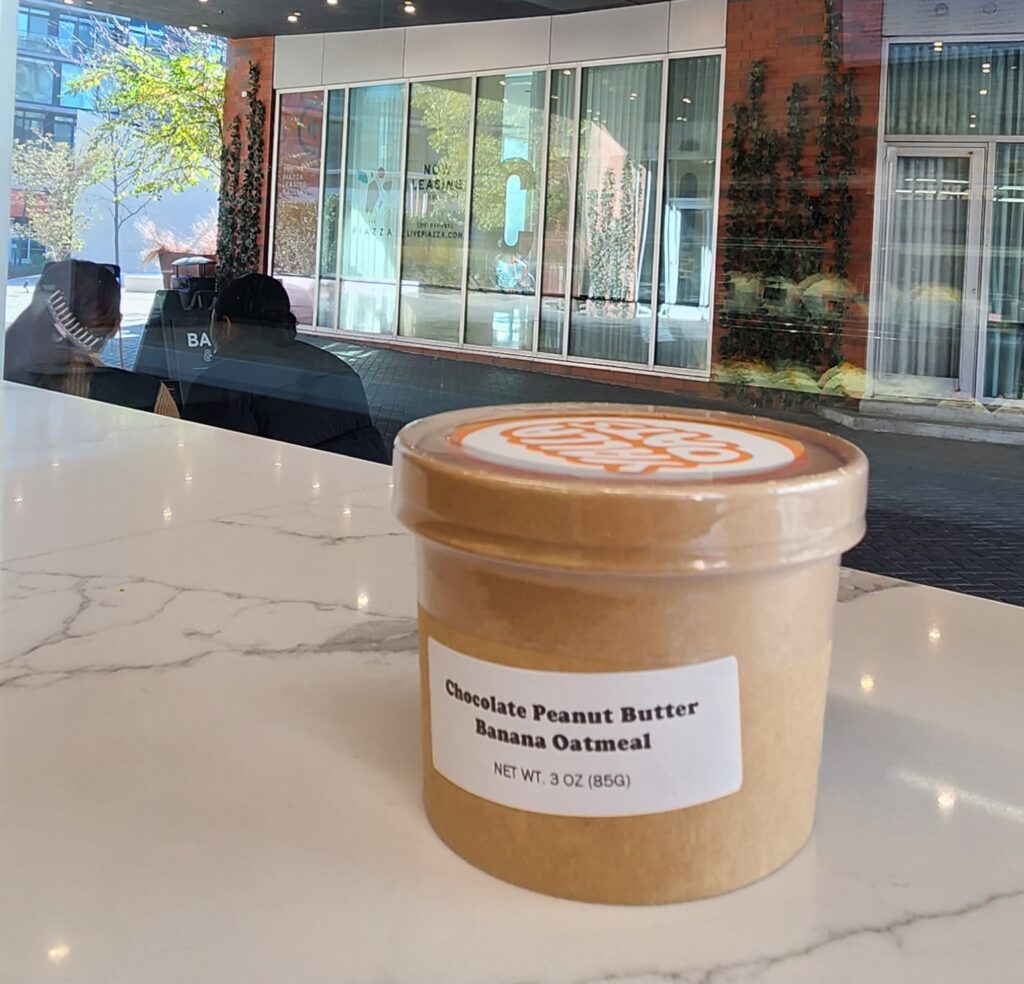
- Visual Punch: The plain brown paper cups blended into the background when placed on store shelves, which failed to grab consumers’ attention in a competitive market.
- Speed of Packaging: The paper cups required a tamper proof seal which was time consuming to apply, making production less efficient and more costly.
- Shelf Stability: Although the paper cups were plastic lined, they still had a weak vapor barrier. As a result, the oatmeal in these cups absorbed moisture too fast, shortening their shelf life and limiting Yalla Oats’ ability to scale production efficiently.
Developing a New Package
Before we jumped into designing a new package, we phoned a long time collaborator and friend, John from JDK3 Design. Together we set to work developing a new package that would breathe new life into this brand.
Materials Selection
When it comes to oatmeal, there are a lot of packaging options. We conducted extensive research, purchasing over 20 different brands of oatmeal to examine their packaging. We tested a variety of options, including lined paper cups, lined paper bags, mylar bags, and even plastic cups.
Since we were working with an overnight oats brand, the package’s ability to withstand heat was a non-factor which opened up a lot of materials. However we had a few key factors to consider.
- Shelf Stability: As mentioned earlier, this is a huge priority as it allows the product to be manufactured far in advance allowing larger less frequent production runs.
- Speed of Packaging: The old adage “time is money” is never more present than during the manufacturing process. The less time it takes to make the less labor, facilities rental, and resources needed to create the product.
- Specialty Equipment: Since Yalla Oats was a small brand, the packaging needed to be easily sealed without the use of extensive speciality equipment.
- Servability: Whether or not that’s a real word,the package also needs to serve as the vessel that the food is prepared in and consumed out of.
- Cost: The food industry has slim margins, so the cheaper the packaging the better.
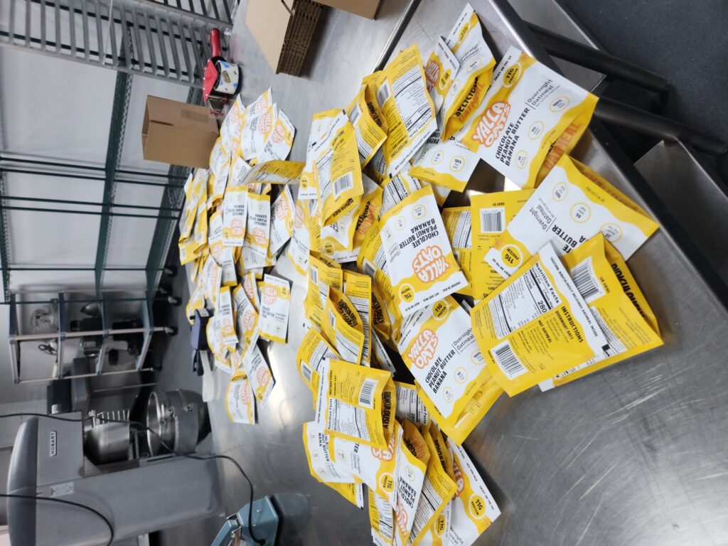
After much research and lots of material samples, we settled on using a mylar pouch. It was the perfect vessel because it had the slowest vapor transfer rate of all of the materials, meaning an exceptionally long shelf life. It also was quick to fill and seal with a standard impulse sealer. Furthermore the product could be easily prepared within the pouch, consumed, and even saved for later with the resealable design. Due to the ease of manufacturing and ability to flatten for shipping, it was also one of the most cost-effective options. d seal with a standard impulse sealer. Furthermore the product could be easily prepared within the pouch, consumed, and even saved for later with the resealable design. Due to the ease of manufacturing and ability to flatten for shipping, it was also one of the lower cost options.
Visuals
Key Information
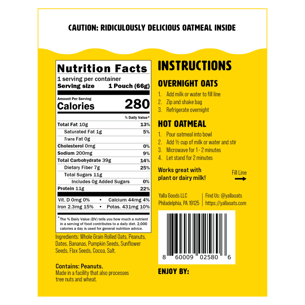
Before we can put pen to paper, or in this day and age mouse to computer, we had to establish which key pieces of information needed to appear on the packaging and where. There were two types of information, compliance based information and sales information.
Compliance Information
Everything we did had to conform to FDA standards. So we made sure we designed a nutritional panel that was compliant with the FDAs guidance. We also had to list out ingredients, weight, the product’s normal name, company information, and more.
Sales information
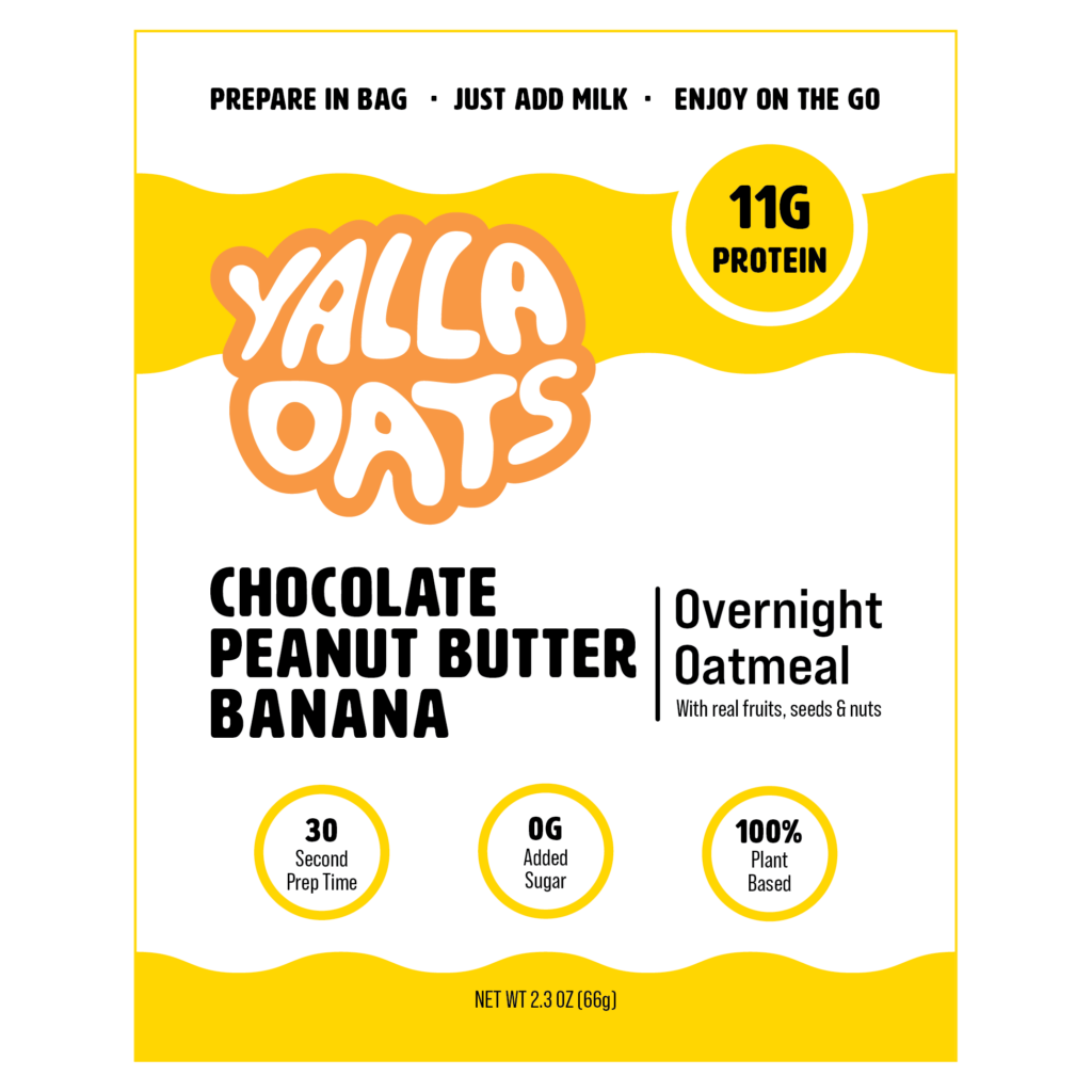
These are the key points about the product that we wanted to draw to the customer’s attention. Think of things like the 10gs of protein per bag or the zero added sugars. We primarily wanted our consumers to see that this was a tasty, healthy, and quick option for breakfast.
Brand Kit
Good design can tell you who makes the product before you even read the label. For example the bottle of Coke-a-Cola. That bottle shape and color is so distinct, you don’t even need the words to know what product you are buying.
In an effort to build this same type of recognition with Yalla Oats and generally follow good design practices, we worked with the existing brand guide to create a package that felt fun and fresh, but wasn’t too out there that you no longer recognized the brand.
The Result
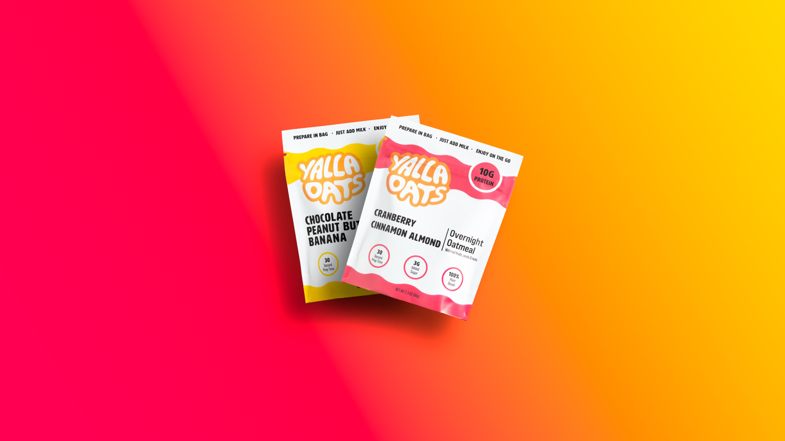
What we settled on was a vibrantly colored package contrasted with white to symbolize each flavor and the milk that they are typically consumed with. The orange brand color was integrated throughout the package.
The packages were an outstanding success, both wowing customers during focus groups and dramatically increasing sales and production efficiency for the brand. At the same time, production efficiency skyrocketed, thanks to the switch from the labor-intensive sealing to the fast, easy-to-fill mylar pouch.
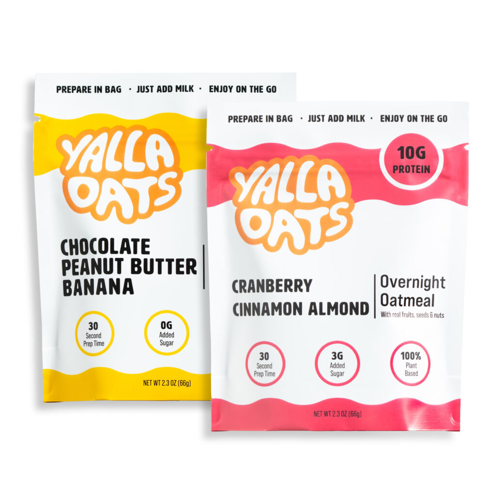
What began as a small-scale brand bottlenecked by their packaging, transformed into a streamlined, visually compelling, and scalable product.
